UI components

Menu

Displays a list of options that a user can choose with robust support for keyboard navigation. Built using the Popover API.

<MenuButton id="menu-demo-btn" target="menu-demo-menu">
  Menu <i class="icon">keyboard_arrow_down</i>
</MenuButton>

<Menu id="menu-demo-menu" anchor="menu-demo-btn" anchor-to="bottom end">
  <div class="group">
    <MenuItem>
      <i class="icon">tab</i>
      <a>New tab</a>
      <kbd>Ctrl+T</kbd>
    </MenuItem>
    <MenuItem>
      <i class="icon">new_window</i>
      <a>New window</a>
      <kbd>Ctrl+N</kbd>
    </MenuItem>
    <MenuItem disabled>
      <i class="icon">fingerprint_off</i>
      <a>Disabled item</a>
      <kbd>Ctrl+Shift+N</kbd>
    </MenuItem>
  </div>
  <div class="group">
    <MenuItem>
      <i class="icon">download</i>
      <a>Downloads</a>
      <kbd>Ctrl+J</kbd>
    </MenuItem>
    <MenuItemSub id="bookmarks-item">
      <i class="icon">bookmarks</i>
      <a>Bookmarks and lists</a>
      <span class="icon arrow">keyboard_arrow_right</span>

      <Menu anchor="bookmarks-item" anchor_to="right start">
        <div class="group">
          <MenuItem>
            <i class="icon">bookmark_add</i>
            <a>Bookmark this tab...</a>
            <kbd>Ctrl+D</kbd>
          </MenuItem>
          <MenuItem>
            <i class="icon">bookmarks</i>
            <a>Bookmark all tabs...</a>
            <kbd>Ctrl+Shift+D</kbd>
          </MenuItem>
        </div>
        <div class="group">
          <MenuItem>
            <i class="icon">toolbar</i>
            <a>Hide bookmarks bar</a>
            <kbd>Ctrl+Shift+B</kbd>
          </MenuItem>
          <MenuItem>
            <i class="icon">bookmarks</i>
            <a>Show all bookmarks</a>
          </MenuItem>
          <MenuItem>
            <i class="icon">bookmark_manager</i>
            <a>Bookmark manager</a>
            <kbd>Ctrl+Shift+O</kbd>
          </MenuItem>
        </div>
      </Menu>
    </MenuItemSub>
  </div>
  <div class="group">
    <MenuItem>
      <i class="icon">print</i>
      <a>Print...</a>
      <kbd>Ctrl+P</kbd>
    </MenuItem>
    <MenuItem>
      <i class="icon">help</i>
      <a>Help</a>
    </MenuItem>
    <MenuItem>
      <i class="icon">settings</i>
      <a>Settings</a>
    </MenuItem>
    <MenuItem>
      <i class="icon">exit_to_app</i>
      <a>Exit</a>
    </MenuItem>
  </div>
</Menu>
@scope (#menu-demo) {
  :scope {
    position: relative;
    display: block;
    padding: 2rem 0.5rem 0;
    height: 300px;
    margin: 0 auto;
  }

  .ui-menubutton {
    border-radius: 0.25rem;
    border-width: 1px;
    background-color: rgb(0 0 0 / 0.1);
    padding-top: 0.25rem;
    padding-bottom: 0.25rem;
    padding-left: 1rem;
    padding-right: 1rem;
    font-weight: 600;
    color: white;
    display: flex;
    align-items: center;
    justify-content: center;
    box-shadow: 0 10px 15px -3px rgb(0 0 0 / 0.1),
    0 4px 6px -4px rgb(0 0 0 / 0.1);
    width: fit-content;
    margin: 0 auto;
  }
  .ui-menubutton:hover {
    background-color: rgb(0 0 0 / 0.2);
  }
  .ui-menubutton .icon {
    margin-left: 0.25rem;
  }

  .group:not([hidden]) ~ .group:not([hidden]) {
    border-top: 1px solid #d1d5db;
  }
  .ui-menu {
    margin-top: 4px;
    padding: 8px 0;
    border-radius: 8px;
    width: 400px;
    background-color: #ffffff;
    box-shadow: 0 1px 3px 4px rgba(0, 0, 0, 0.2);
    overflow: visible;
    font-size: 0.9rem;
    font-weight: 400;
    transition: all 0.2s allow-discrete;
    /* Final state of the exit animation */
    opacity: 0;
    transform: translateY(-1rem);
  }
  .ui-menu:popover-open {
    opacity: 1;
    transform: translateY(0);
  }
  /* Needs to be after the previous .ui-menu:popover-open rule
  to take effect, as the specificity is the same */
  @starting-style {
    .ui-menu:popover-open {
      opacity: 0;
      transform: translateY(-1rem);
    }
  }
  .ui-menu:focus {
    outline: none;
  }
  .ui-menu .ui-menu {
    position: absolute;
    margin: 0 0 0 -4px;
    width: 300px;
    z-index: 1;
    transition: opacity 0.2s allow-discrete;
  }
  .ui-menu * {
    user-select: none;
  }

  .ui-menuitem {
    display: flex;
    height: 40px;
    padding-left: 24px;
    padding-right: 24px;
    align-items: center;
    justify-items: flex-start;
    line-height: 40px;
    color: #000000;
    background-color: #ffffff;
    cursor: default;
    user-select: none;
    position: relative;
    text-align: left;
  }
  .ui-menuitem.ui-selected {
    background-color: #f2e7e4;
  }
  .ui-menuitem.ui-disabled {
    color: #5f6368;
  }
  .ui-menuitem > .icon {
    font-size: 1rem;
    width: 24px;
    text-align: left;
  }
  .ui-menuitem.ui-disabled > .icon {
    color: #aca6a7;
  }
  .ui-menuitem > a {
    flex-grow: 1;
  }
  .ui-menuitem > kbd {
    visibility: hidden;
    margin-left: auto;
    font-size: 0.9rem;
    font-family: inherit;
    text-align: right;
    color: #524f50;
  }
  .ui-menuitem:not(.ui-disabled):hover > kbd {
    visibility: visible;
  }
  .ui-menuitem > .arrow {
    margin-left: auto;
    font-size: 0.7rem;
    text-align: right;
  }
}

Note: This component does not handle keyboard shortcuts, here are shown only as an example.

Menus are built using the Menu, MenuButton, MenuItem, and MenuItemSub components. Clicking on menu button or activating it with the keyboard will show the corresponding menu.

<MenuButton>Open menu</<MenuButton>
<Menu>
  <MenuItem> item1 </MenuItem> 〈-- Regular item
  <MenuItem> item2 </MenuItem>
  <MenuItem> item3 </MenuItem>
  <MenuItemSub> item4 〈----------- An item with a submenu
    <Menu> ... </Menu>〈----------- Submenu
  </MenuItemSub>
</Menu>

A Menu starts hidden on page load by having display:none set on it (the Popover API does it automatically). To show/hide the menu, you need to add a MenuButton.

When a Menu is shown, it has display:none removed from it and it is put into the top layer so, unlike just using position: absolute, it's guaranteed that it will sit on top of all other page content.

Anchor positioning

By default, the menu appears centered in the layout view, but this component allows you to position it relative to an specific element in the page, using the anchor and anchor-to attributes.

anchor is the ID of the element used as a reference, and anchor-to which side of the anchor to use: "top", "bottom", "right", or "left"; with an optional postfix of "start" or "end" ("center" is the default).

Anchor positioning

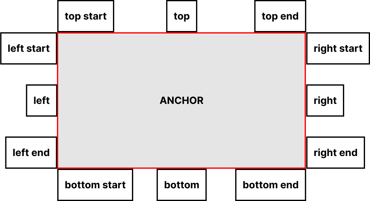
The positioning is done every time the menu opens, but you can trigger the re-position, for example, on windows resizing, by calling the jxui-popover/setPosition(menu) function.

Styling states

CSS selector Description
.ui-menu Every menu has this class
.ui-menu:popover-open This pseudo-class matches only menus that are currently being shown
::backdrop This pseudo-element is a full-screen element placed directly behind showing menu elements in the top layer, allowing effects to be added to the page content behind the menu(s) if desired. You might for example want to blur out the content behind the menu to help focus the user's attention on it

To animate a menu, follow the Animating popovers section in the Popover page.

Component arguments

MenuButton

Argument Type Default Description
target str Required. The ID of the linked Popover component.
action str "toggle" "open", "close", or "toggle".
tag str "button" HTML tag of the component.

Menu

Argument Type Default Description
mode str "auto" "auto" or "manual".
anchor str ID of the element used as an anchor
anchor-to str Which side/position of the anchor to use: "top", "bottom", "right", or "left"; with an optional postfix of "start", "end", "center".
tag str "div" HTML tag of the component.

MenuItem

Argument Type Default Description
mode str "auto" "auto" or "manual".

MenuSubItem

Argument Type Default Description
mode str "auto" "auto" or "manual".

Accessibility notes

Mouse interaction

  • Clicking a PopButton will trigger the button action (open, close, or toggle state).

  • Clicking outside of a Popover will close all the Popover with mode="auto".

Keyboard interaction

  • Pressing the Enter or Space keys on a PopButton will trigger the button action (open, close, or toggle state), and close all the Popover with mode="auto".

  • Pressing the Escape key will close all the Popover with mode="auto".