Pop-over
A wrapper over the Popover API with anchor positioning.
Pop-overs are powerful components with many use cases like edit menus, custom notifications, content pickers, or help dialogs.
They can also be used for big hideable sidebars, like a shopping cart or action panels.
Pop-overs are always non-modal. If you want to create a modal popoverover, a Dialog
component is the way to go instead.
Edit Dimensions
<PopButton id="pop-demo-btn" target="pop-demo-pop">Open popover</PopButton>

<Popover id="pop-demo-pop" anchor="pop-demo-btn" anchor-to="bottom">
  <h1>Edit Dimensions</h1>
  <fieldset class="space-y-2">
    <label>
      <span>Width</span>
      <input type="text" name="width" value="340px">
    </label>
    <label>
      <span>Height</span>
      <input type="text" name="height" value="25px">
    </label>
  </fieldset>

  <svg class="arrow" width="10" height="5" viewBox="0 0 30 10" aria-hidden="true">
    <polygon points="0,0 30,0 15,10"></polygon>
  </svg>
</Popover>
.ui-popbutton {
  border-radius: 0.25rem;
  border-width: 1px;
  background-color: rgb(0 0 0 / 0.1);
  padding-top: 0.25rem;
  padding-bottom: 0.25rem;
  padding-left: 1rem;
  padding-right: 1rem;
  font-weight: 600;
  color: white;
  box-shadow: 0 10px 15px -3px rgb(0 0 0 / 0.1),
  0 4px 6px -4px rgb(0 0 0 / 0.1);
}
.ui-popbutton:hover {
  background-color: rgb(0 0 0 / 0.2);
}

[popover] {
  background-color: Canvas;
  border-radius: 0.25rem;
  border: 1px solid #666;
  color: CanvasText;
  height: fit-content;
  margin: 0.75rem auto 0;
  padding: 1rem;
  width: 15rem;
  overflow: visible;
  transition: all 0.2s allow-discrete;
  /* Final state of the exit animation */
  opacity: 0;
  transform: translateY(-3rem);
}
[popover]:popover-open {
  opacity: 1;
  transform: translateY(0);
}
/* Needs to be after the previous [popover]:popover-open rule
to take effect, as the specificity is the same */
@starting-style {
  [popover]:popover-open {
    opacity: 0;
    transform: translateY(-3rem);
  }
}

/* Transition for the popover's backdrop */
[popover]::backdrop {
  transition: all 0.2s allow-discrete;
  /* Final state of the exit animation */
  background-color: rgb(0 0 0 / 0%);
}
[popover]:popover-open::backdrop {
  background-color: rgb(0 0 0 / 15%);
}
/* The nesting selector (&) cannot represent pseudo-elements
so this starting-style rule cannot be nested */
@starting-style {
  [popover]:popover-open::backdrop {
    background-color: rgb(0 0 0 / 0%);
  }
}

[popover] h1 {
  font-weight: bold;
  margin-bottom: 0.75rem;
}
[popover] label {
  display: flex;
  align-items: center;
  justify-content: space-between;
  font-size: 0.75rem;
  line-height: 1rem;
}
[popover] input {
  margin-left: auto;
  width: 66.666667%;
  border-radius: 0.25rem;
  border-width: 1px;
  padding: 0.25rem;
  font-size: 0.75rem;
  line-height: 1rem;
}
[popover] svg.arrow {
  position: absolute;
  top: -4px;
  left: 50%;
  z-index: 10;
  display: block;
  transform: rotate(180deg);
  border-color: rgb(255 255 255);
  fill: white;
}
A Popover starts hidden on page load by having display:none set on it (the Popover API does it automatically). To show/hide the popover, you need to add some control PopButtons.
When a popover is shown, it has display:none removed from it and it is put into the top layer so, unlike just using position: absolute, it's guaranteed that it will sit on top of all other page content.
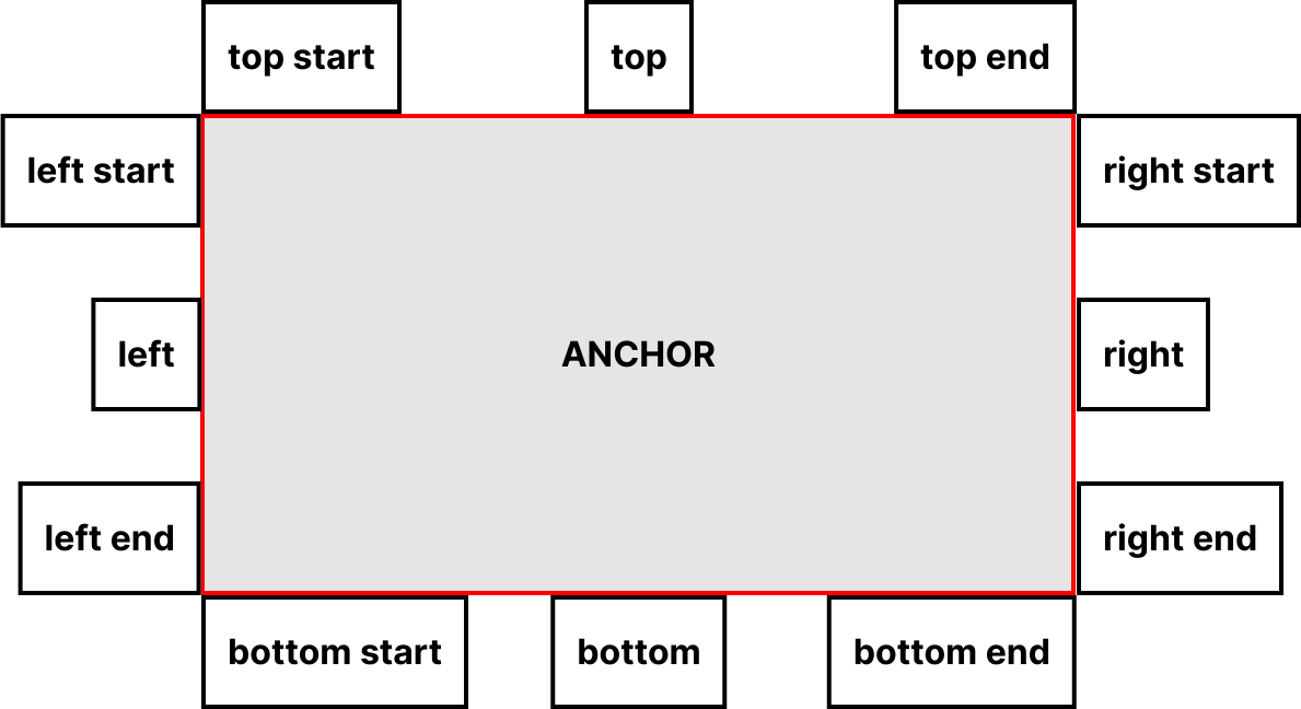
Anchor positioning
By default, a popover appears centered in the layout view, but this component allows you to position it relative to an specific element in the page, using the anchor and anchor-to attributes.
anchor is the ID of the element used as a reference, and anchor-to which side of the anchor to use: "top", "bottom", "right", or "left"; with an optional postfix of "start" or "end" ("center" is the default).
The positioning is done every time the popover opens, but you can trigger the re-position, for example, on windows resizing, by calling the jxui-popover/setPosition(popover) function.
Styling states
| CSS selector | Description |
|---|---|
[popover] |
Every popover has this attribute |
:popover-open |
This pseudo-class matches only popovers that are currently being shown |
::backdrop |
This pseudo-element is a full-screen element placed directly behind showing popover elements in the top layer, allowing effects to be added to the page content behind the popover(s) if desired. You might for example want to blur out the content behind the popover to help focus the user's attention on it |
Closing modes
A Popover can be of two types: "auto" or "manual". This is controlled by the mode argument.
| Argument | Description |
|---|---|
mode="auto" |
The Popover will close automatically when the user clicks outside of it, or when presses the Escape key. |
mode="manual" |
The Popover will not close automatically. It will only close when the user clicks on a linked PopButton with action="close" or action="toggle". |
If the mode argument is not set, it defaults to "auto".
PopButton actions
A PopButton can have an action argument, which can be set to one of three values: "open", "close", or "toggle". This argument determines what happens to the target Popover when the button is clicked.
| Argument | Description |
|---|---|
action="open" |
Opens the target Popover. If the Popover is already open, it has no effect. |
action="close" |
Closes the target Popover. If the Popover is already closed, it has no effect. |
action="toggle" |
This is the default action. It toggles the target `Pop – opening it if it's closed and closing it if it's open. |
Animating popovers
Popovers are set to display:none; when hidden and display:block; when shown, as well as being removed from / added to the top layer. Therefore, for popovers to be animated, the display property [needs to be animatable].
Supporting browsers animate display flipping between none and another value of display so that the animated content is shown for the entire animation duration. So, for example:
- When animating
displayfromnonetoblock(or another visibledisplayvalue), the value will flip toblockat0%of the animation duration so it is visible throughout. - When animating
displayfromblock(or another visibledisplayvalue) tonone, the value will flip tononeat100%of the animation duration so it is visible throughout.
Transitioning a popover
When animating popovers with CSS transitions, the following features are required:
-
@starting-styleat-ruleProvides a set of starting values for properties set on the popover that you want to transition from when it is first shown. This is needed to avoid unexpected behavior. By default, CSS transitions only occur when a property changes from one value to another on a visible element; they are not triggered on an element's first style update, or when the
displaytype changes fromnoneto another type. -
displaypropertyAdd
displayto the transitions list so that the popover will remain asdisplay:block(or another visibledisplayvalue) for the duration of the transition, ensuring the other transitions are visible. -
overlaypropertyInclude
overlayin the transitions list to ensure the removal of the popover from the top layer is deferred until the transition completes, again ensuring the transition is visible. -
transition-behaviorpropertySet
transition-behavior:allow-discreteon thedisplayandoverlaytransitions (or on thetransitionshorthand) to enable discrete transitions on these two properties that are not by default animatable.
For example, let's say the styles we want to transition are opacity and transform: we want the popover to fade in or out while moving down or up.
To achieve this, we set a starting state for these properties on the hidden state of the popover element (selected with the [popover] attribute selector) and an end state for the shown state of the popover (selected via the :popover-open pseudo-class). We also use the transition property to define the properties to animate and the animation's duration as the popover gets shown or hidden:
/*** Transition for the popover itself ***/
[popover]:popover-open {
  opacity: 1;
  transform: scaleX(1);
}
[popover] {
  transition: all 0.2s allow-discrete;
  /* Final state of the exit animation */
  opacity: 0;
  transform: translateY(-3rem);
}
[popover]:popover-open {
  opacity: 1;
  transform: translateY(0);
}
/* Needs to be after the previous [popover]:popover-open rule
to take effect, as the specificity is the same */
@starting-style {
  [popover]:popover-open {
    opacity: 0;
    transform: translateY(-3rem);
  }
}

/*** Transition for the popover's backdrop ***/
[popover]::backdrop {
  /* Final state of the exit animation */
  background-color: rgb(0 0 0 / 0%);
  transition: all 0.2s allow-discrete;
}
[popover]:popover-open::backdrop {
  background-color: rgb(0 0 0 / 15%);
}
@starting-style {
  [popover]:popover-open::backdrop {
    background-color: rgb(0 0 0 / 0%);
  }
}
You can see a working example of this in the demo at the beginning of the page.
So it is possible for the style transition on entry and exit to be different.
Component arguments
PopButton
| Argument | Type | Default | Description |
|---|---|---|---|
target |
str |
Required. The ID of the linked Popover component. |
|
action |
str |
"toggle" |
"open", "close", or "toggle". |
tag |
str |
"button" |
HTML tag of the component. |
Pop
| Argument | Type | Default | Description |
|---|---|---|---|
mode |
str |
"auto" |
"auto" or "manual". |
anchor |
str |
ID of the element used as an anchor | |
anchor-to |
str |
Which side/position of the anchor to use: "top", "bottom", "right", or "left"; with an optional postfix of "start", "end", "center". | |
tag |
str |
"div" |
HTML tag of the component. |
Accessibility notes
Mouse interaction
-
Clicking a
PopButtonwill trigger the button action (open, close, or toggle state). -
Clicking outside of a
Popoverwill close all thePopoverwithmode="auto".
Keyboard interaction
-
Pressing the Enter or Space keys on a
PopButtonwill trigger the button action (open, close, or toggle state), and close all thePopoverwithmode="auto". -
Pressing the Escape key will close all the
Popoverwithmode="auto".