Slots / Content
Besides attributes, components can also accept content to render inside them.
Everything between the open and close tags of the components will be rendered and passed to the component as an implicit content variable
This is a very common pattern, and it is called a slot. A slot is a placeholder for content that can be provided by the user of the component. For example, we may have a <FancyButton> component that supports usage like this:
<FancyButton>
  <i class="icon></i> Click me!
</FancyButton>
The template of <FancyButton> looks like this:
<button class="fancy-btn">
  {{ content }}
</button>
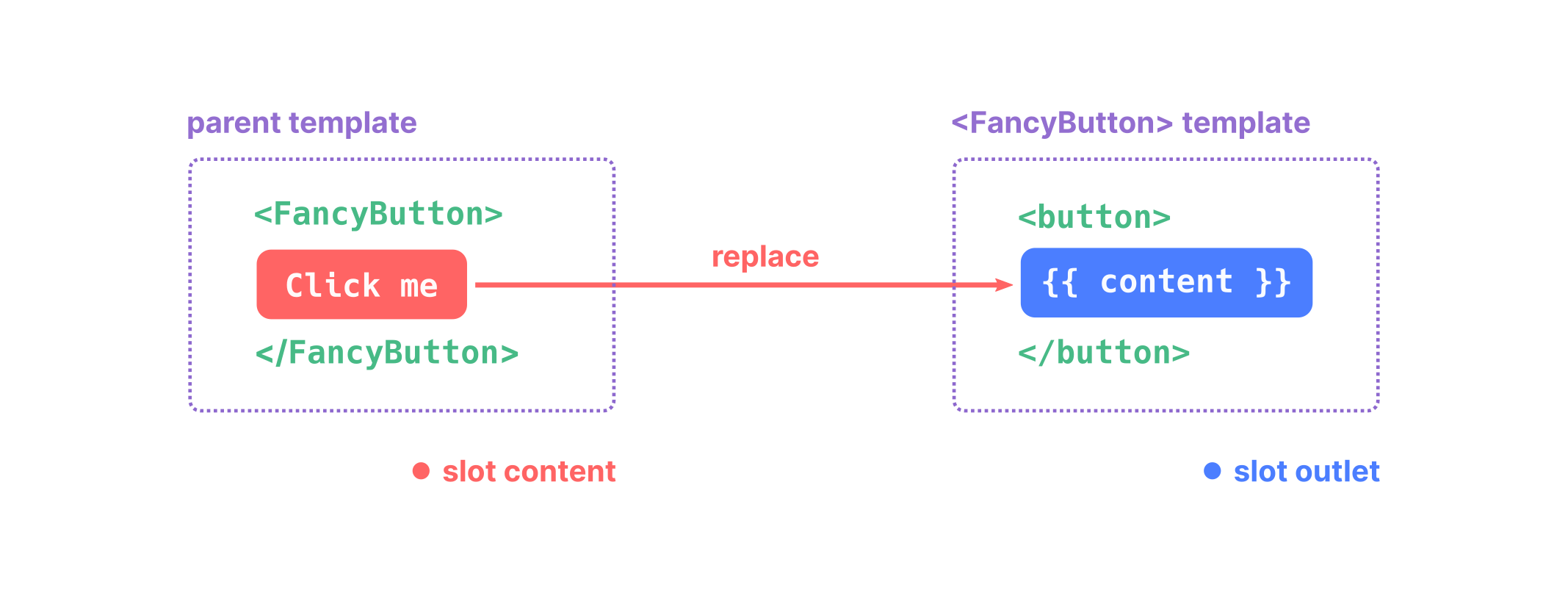
The <FancyButton> is responsible for rendering the outer <button> (and its fancy styling), while the inner content is provided by the parent component.
A great use case of the content is to make layout components:
{#def posts #}
<Layout title="Archive">
  {% for post in posts %}
    <Post post={post} />
  {% endfor %}
</Layout>
{#def title #}
<!DOCTYPE html>
<html lang="en">
<head>
  <meta charset="utf-8">
  <title>{{ title }}</title>
</head>
<body>
  {{ content }}
</body>
Fallback Content
There are cases when it's useful to specify fallback (i.e. default) content for a slot, to be rendered only when no content is provided. For example, in a <SubmitButton> component:
<button type="submit">
  {{ content }}
</button>
We might want the text "Submit" to be rendered inside the <button> if the parent didn't provide any slot content. The special "content" variable is just a string like any other, so we can test if it's empty to make "Submit" the fallback content:
<button type="submit">
  {% if content %}
    {{ content }}
  {% else %}
    Submit  <!-- fallback content -->
  {% endif %}
</button>
Now when we use <SubmitButton> in a parent component, providing no content for the slot:
<SubmitButton />
This will render the fallback content, "Submit":
<button type="submit">Submit</button>
But if we provide content:
<SubmitButton>Save</SubmitButton>
Then the provided content will be rendered instead:
<button type="submit">Save</button>
Multiple content slots (a.k.a. "named slots")
There are cases when a component is complex enough to need multiple content slots. For example, a <Modal> component might need a header, a body, and a footer content.
One way to implement it is using multiple content slots. To do so, instead of rendering content as a string, you can also call it with name. Then, the parent component can provide a content for that name.
Note the _slot special variable. This is automatically available in the content in the parent component and contains the named the component has used to call request its content.
The _slot variable is scoped to the content of that component, so it's not available outside of it:
<FancyButton>
  {% if _slot == "hi" %} {# <--- _slot #}
  Hello{% endif %}
</FancyButton>

<FancyButton2>
  {% if _slot == "hi" %} {# <--- This _slot is a different one #}
  Sup?{% endif %}
</FancyButton2>

{{ _slot }}   {# <--- Undefined variable #}
Composability: better than named slots
Named slots are a quick way to have multiple content slots, but are a bit messy beyond some simple cases.
Composability offers a more flexible and idiomatic approach when multiple content slots are needed. The idea is to have separated components for each content slot, and then compose them together. Let's explore this concept using the same example as above.
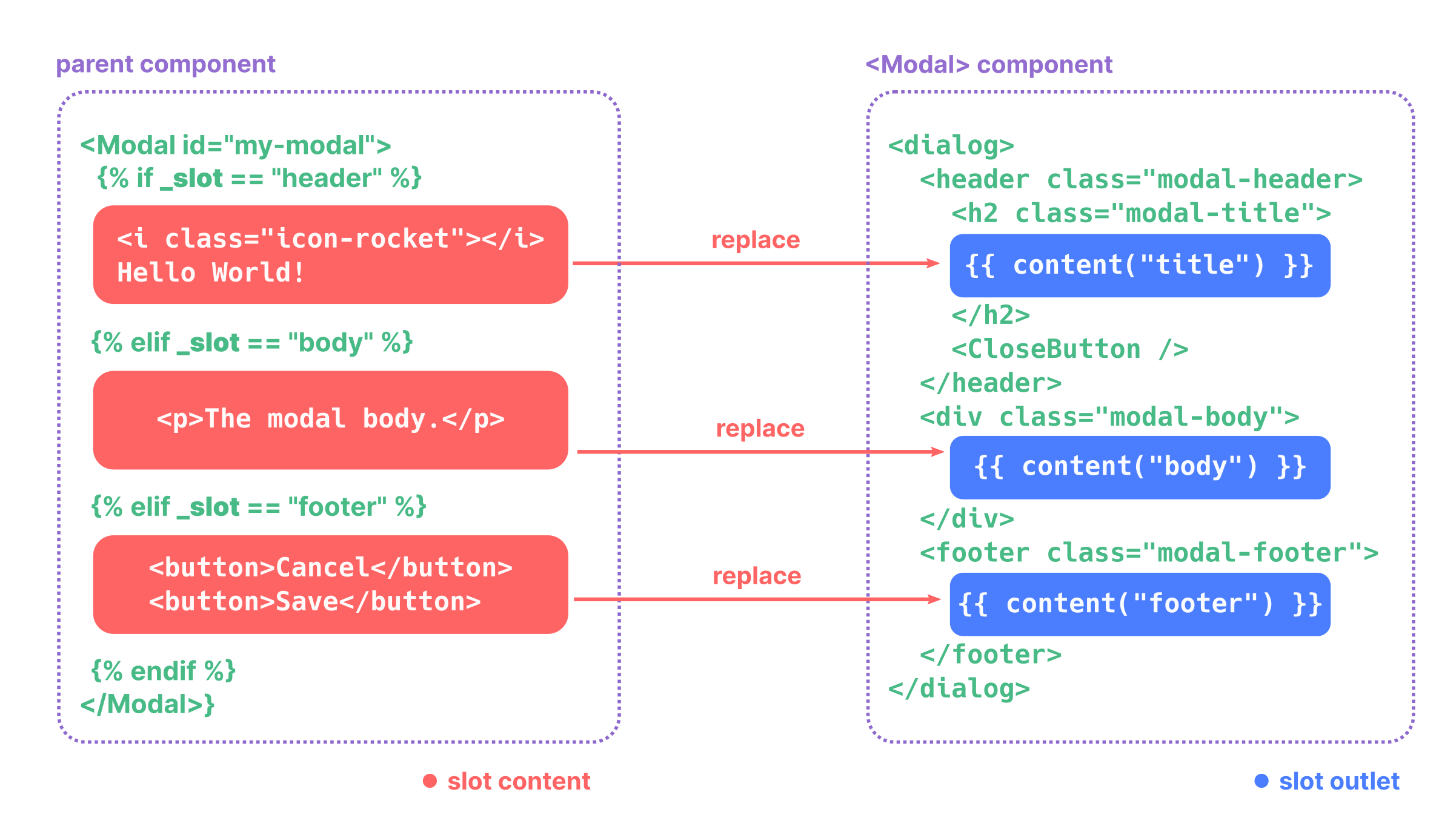
Consider a Modal component that requires three distinct sections: a header, a body, and a footer. Instead of using named slots, we can create separate components for each section and composing them within a Modal component wrapper.
<Modal>

  <ModalHeader>
    <i class="icon-rocket"></i>
    Hello World!
  </ModalHeader>

  <ModalBody>
    <p>The modal body.</p>
  </ModalBody>

  <ModalFooter>
    <button>Cancel</button>
    <button>Save</button>
  </ModalFooter>

</Modal>
Now, the Modal component is responsible for rendering the outer <dialog> and its styling, while the inner content is provided by the child components.
<dialog class="modal">
  {{ content }}
</dialog>
<header class="modal-header>
  <h2 class="modal-title">
    {{ content }}
  </h2>
  <CloseButton />
</header>
<div class="modal-body">
  {{ content }}
</div>
<footer class="modal-footer">
  {{ content }}
</footer>
Advantages of Composability
- Flexibility: You can easily rearrange, omit, or add new sections without modifying the core
Modalcomponent. - Reusability: Each section (
ModalHeader,ModalBody,ModalFooter) can be used independently or within other components. - Maintainability: It's easier to update or style individual sections without affecting the others.
Testing components with content
To test a component in isolation, you can manually send a content argument using the special _content argument:
catalog.render("PageLayout", title="Hello world", _content="TEST")